Business cards in 2026: materials, finishes and formats that leave a mark
Published 5 July 2026 · Welye products
Its death has been announced for a decade, and yet: in a handshake, the business card remains the only medium that physically passes from you to the other person. What has changed is the bar — a thin, shiny card no longer cuts it. Here's what makes the difference in 2026.
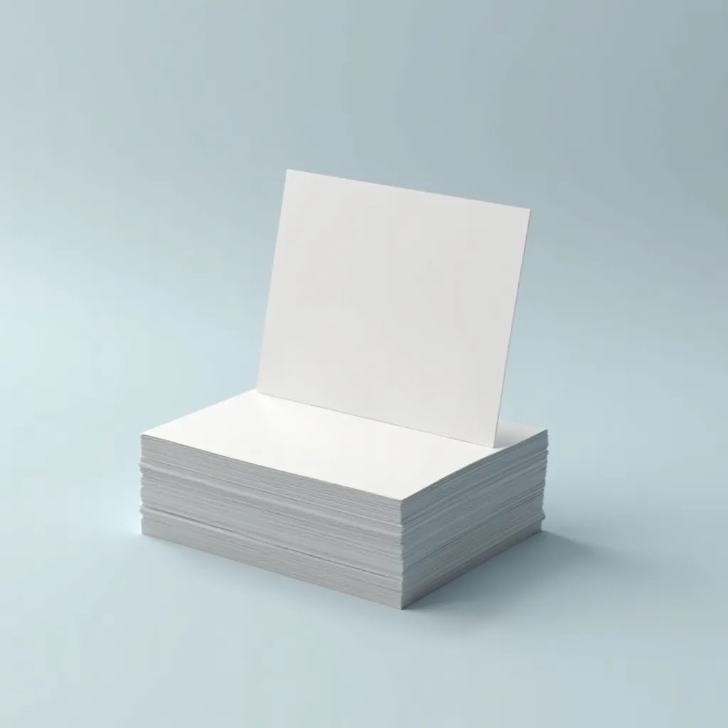
Touch first: the papers
Before anyone reads a card, they feel it. That's why weight is the first choice: heavy stocks (350 gsm and up) instantly convey seriousness and rigidity. Beyond weight, texture speaks: smooth coated for crisp solids, textured creative papers (felt grain, cotton) for a crafted or premium spirit.
The finishes that keep a card on the desk
- ✓Soft-touch lamination: a velvet "peach-skin" veil — the most talked-about finish in meetings. Paired with a heavy stock, it turns the card into an object.
- ✓Hot foil stamping: gold, silver, copper or holographic, heat-pressed for a mirror effect on a logo or a name. A staple of consulting, law and beauty.
- ✓3D spot UV: raised varnish on a precise area — the logo catches the light and can be felt under the finger.
- ✓Embossing / debossing: the motif raised or recessed, without ink. Understated and spectacular at once.
- ✓Coloured edges: colour on the card's thickness — the detail people notice when the card lies on a table.
The full tour of these techniques is on our finishing page.
Formats: the classic and the side-steps
85 × 55 mm remains the standard — it fits every card holder. But a side-step gets noticed: the square format for creative trades, rounded corners for softness, the mini format for boldness. One rule only: stay within a size that stores away, or the card gets lost.
A smart reverse side
The front carries the identity (name, role, contact); the back is often wasted space. The best uses we see in the workshop: a QR code to a booking page or vCard (see our rules for an effective QR code), a positioning line, a full-bleed visual extending the brand world — or the French version for international profiles.
A full family: card stationery
The business card has cousins worth coordinating: the correspondence card for handwritten notes (the gesture that stands out in an all-digital age), the loyalty card for retail, the greeting card at year's end. Printed on the same stocks with the same finishes, they form a true identity stationery set.
What we check before printing
In the workshop, every card file goes through a pre-proof check: bleed, safety margins around text, rich black for solids, logo resolution. It's free, and it prevents the vast majority of disappointments — details in our artwork guide.
Unsure about the finish? Describe your business and the effect you’re after in your quote request: we’ll guide you to the right combination. The full range is on the business cards page.
A card that sounds like you
Tell us about your business and the tone you're after: we'll suggest the material and finish that fit. Free quote.